A visual identity to question and engage
For the Semaine d’Actions Contre le Racisme, we developed a visual identity designed as an evolving tool for the communication campaign.
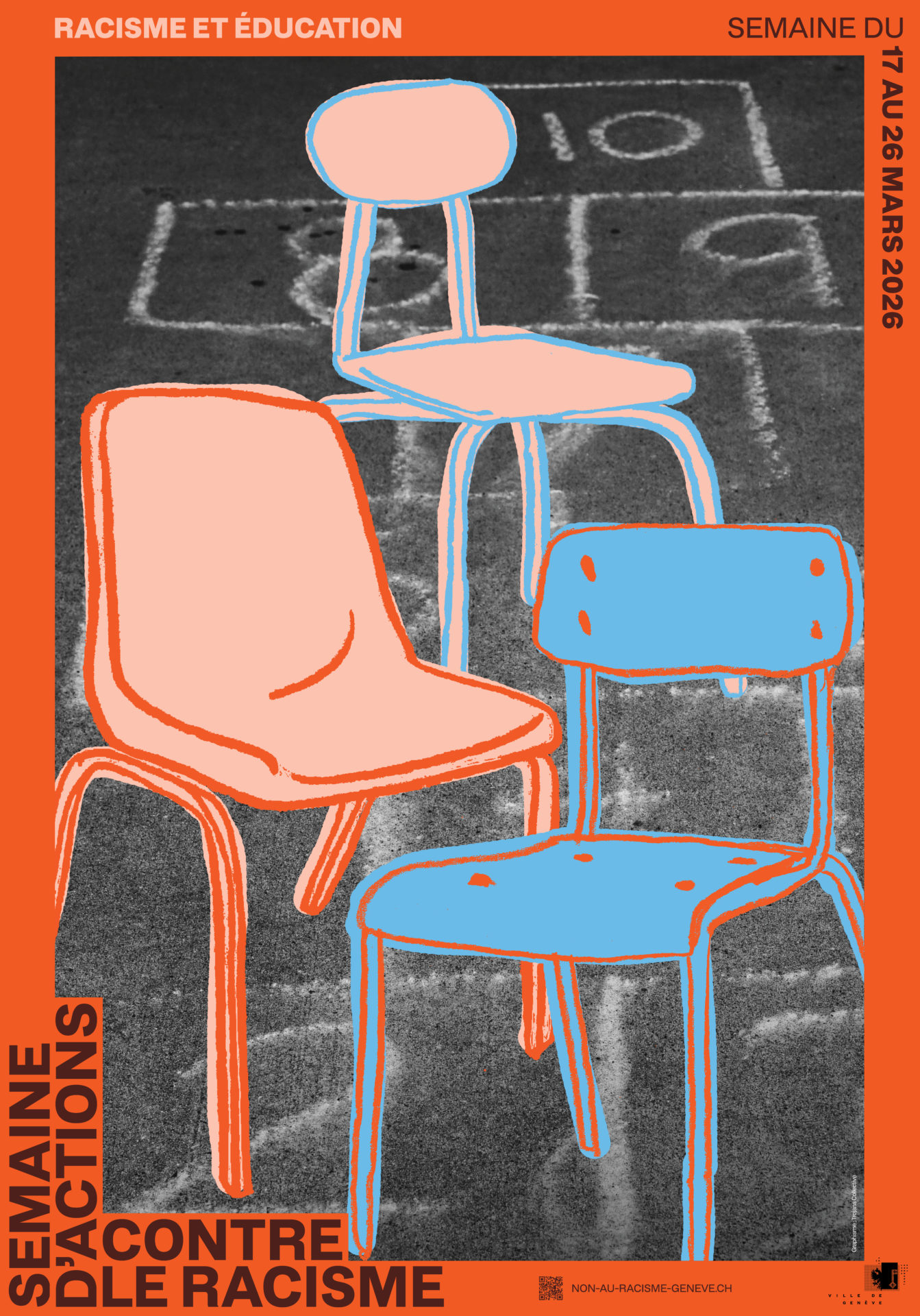
Our approach is based on the idea that fighting racism also involves education, transmission and reframing the words we use. At the core of the visual identity, the logo is built from graphic frames that interlock and shift, creating multiple possible readings. Our graphic system relies on an open-source typeface, ensuring an accessible identity.
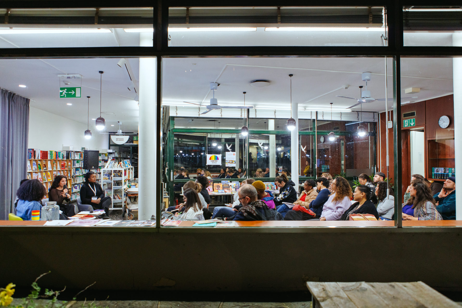
The frame, derived from the identity system, acts as a window that invites viewers to look at social realities through the lens of the Semaine d’Actions Contre le Racisme.
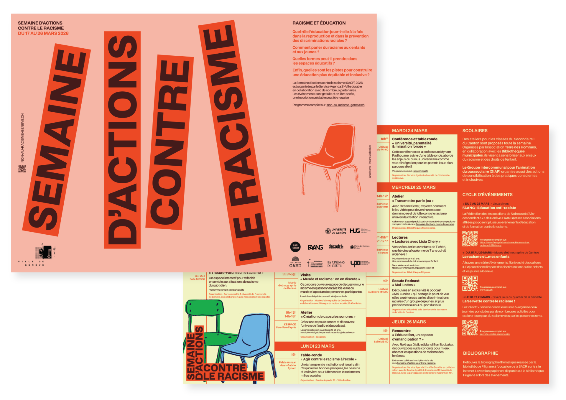
The identity is structured around two complementary temporalities:
– a permanent logo, designed to accompany the initiative over time;
– a poster renewed each year, allowing new perspectives to emerge and highlighting different themes.
Finally, the rich and expansive color palette allows the identity to evolve across editions while maintaining a coherent visual language.
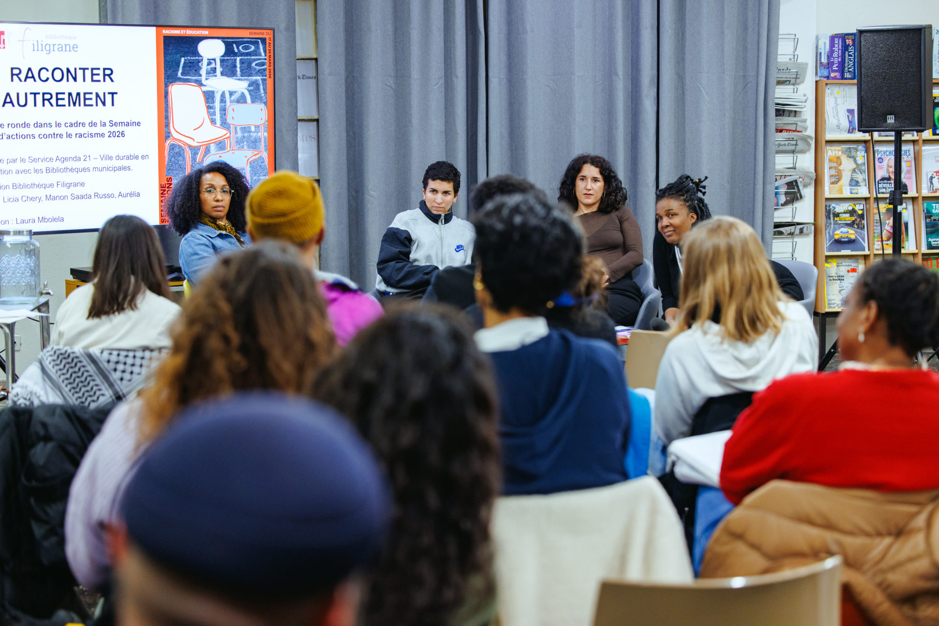
Photos Credits : ©Kenza Wadimoff