Grand Tour and Diploma 2023

Branding, Print & Digital Communication

Grand Tour and Diploma 2023

Branding, Print & Digital Communication

Floating arches, a moment of transition 

For the Grand Tour and Diploma 2023, we developed a communication campaign centered around the idea of an arch—a symbol of passage and transition from one state to another. Graduation is inherently a moment of transformation and uncertainty, moving from months of intense preparation to the leap into the professional world. 

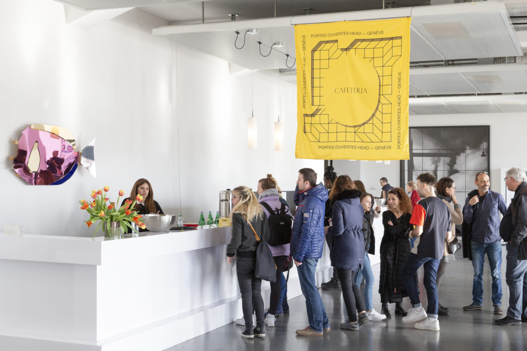
Inspired by this concept of “floating arches,” we designed two versions, one for the Grand Tour in a yellow and red palette, and another for the Fête des Diplômes in turquoise and blue tones.

The use of rounded, extra-bold typography complemented the ethereal theme. 

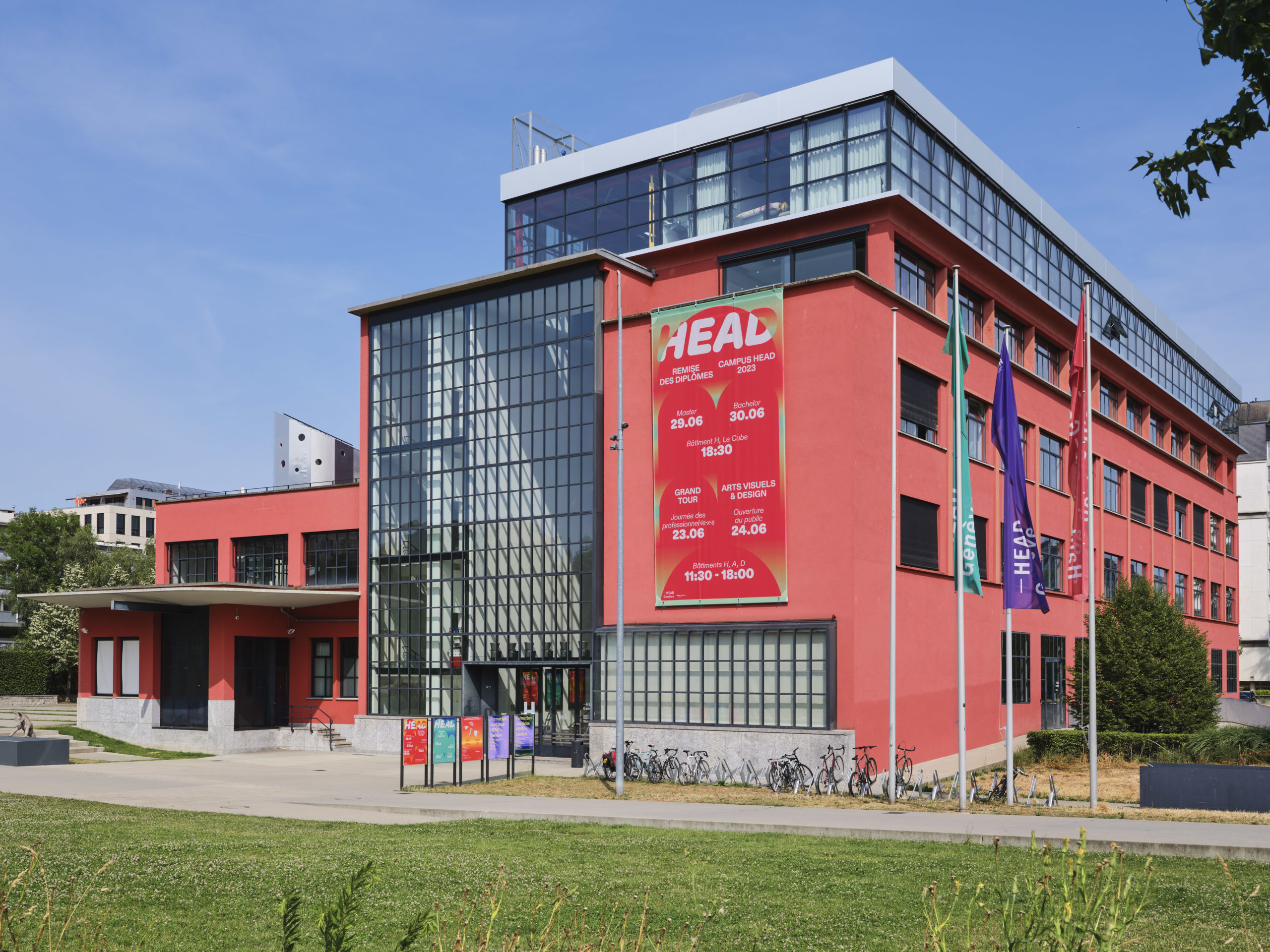
For each version, we produced large-format prints, posters, social media animations, screen presentations for the diploma ceremony, flyers, and a booklet with a map of the school and the locations of each department. 

Images © Raphael Lugassy – HEAD © Kelly De GeerWebsite developed by Charles Chalas

A typography for the year 

Branding, Print & Digital Communication

A typography for the year 

Branding, Print & Digital Communication

HEAD– Genève 2024-25 Communication

During the 2024-25 HEAD – Genève academic year, we are designing a series of communication materials for key moments, such as the Welcome Week, the Semaine de Tous les Possibles, and the exam period.

To ensure consistency across all events, we chose a specific typography and visual logic that unified the entire year’s communications.

Our first communication of this series, the Welcome Week, we worked with a pale pink and black palette, using a typographic structure based on a pyramid-like composition.

For each event, we are required to create posters, various digital formats, and animations for social media, as well as content for the on-campus screens.

Forum des Fondations 

Print & Digital Communication

Forum des Fondations 

Print & Digital Communication

A Grid, Two Colors, and a Date

For the Forum des Fondations, Swiss Foundations commissioned us to develop a comprehensive graphic concept for both online and offline visual communication. Leveraging their established red and white color scheme, we designed a dynamic and adaptable visual system based on a grid structure.

The grid forms the foundation of a modular design, with squares and rectangles filled with color and rhythmically animated to create a vibrant and engaging visual experience.

This approach ensures flexibility and consistency across various platforms, from digital assets to print materials. 

The concept was crafted to not only reflect the identity of Swiss Foundations but also to capture the essence of the Forum des Fondations, highlighting the event’s significance and facilitating a cohesive and memorable experience for the audience. 

Grand Tour and Diploma 2024

Branding, Print & Digital Communication

Grand Tour and Diploma 2024

Branding, Print & Digital Communication

A connected diagram for the HEAD 2024 Communication. 

For the Fête des Diplômes and the Grand Tour 2024, we designed a communication campaign based on the concept of a scientific diagram, where various colored shapes are interconnected. The diversity of shapes represents the diversity of students, graduates, and fields of study at HEAD–Genève

We created a version for the Grand Tour, where the shapes are connected by a thread, and a version for the Diploma Graduation, where the shapes overlap like stickers stacked on top of one another. Additionally, we designed a variant for the cinema festival also hosted by HEAD during the same period, showcasing films by cinema graduates and students.

For this, we created a masked shape, composed of the same original elements, that frames stills from the films.

For each version, we produced, among other items, large-format prints, posters, social media animations, screen presentations for the diploma ceremony, flyers, and a booklet with a map of the school and locations of each department. 

Images by © Sylvain Leurent

A Transversal Conference

Event

Vue de la salle George Ador lors des Open days par Trojans Collective. Merging graphic and space

A Transversal Conference

Event

Merging Graphic and Space Design

For the 2020 HEAD – Genève Open Days, we designed the scenography for two conference spaces, as well as exhibition and reception signage, to welcome and guide visitors throughout the school. We developed the concept of “Patterns” by merging graphic and space design under a shared visual identity: a yellow grid on a black background. 

For the conference spaces, our aim was to create an open, collaborative environment for dialogue rather than a traditional setting for one-way communication. To achieve this, we placed both speakers and the audience at floor level, seated on collective benches made of wooden cubes of varying heights.

These cubes appeared to emerge naturally from the patterned floor, as though they were extrusions of the grid. The floor design, defined by yellow lines, functioned as both a visual element and a floor plan, delineating the conference space and inviting people to sit within the grid’s cells. 

Printed flags extended the graphic motif from the floor to the ceiling, marking the locations of different departments within the building and highlighting entrances. 

Scénographie Portes Ouvertes Drapeau en tissu, sol Vynile jaune et cubes noir en bois. une grille qui se retrouve sur tous ls éléments du Open Day 2020 - Merging graphic and space
Cube noir placé dans une grille géométrique - Scénographie pour les Open Days 2020 HEAD - Merging graphic and space
Vue d'ensemble Open Days Scenographie Trojans Collective - Merging graphic and space
Drapeau réalisé avec le motif qu'on retrouve également au sol lors de l'évènement. Open Days 2020 Trojans Collective - Merging graphic and space